
Design That Sells: Why Younger Consumers Choose Wines That Look Modern
Reading time: 2 min
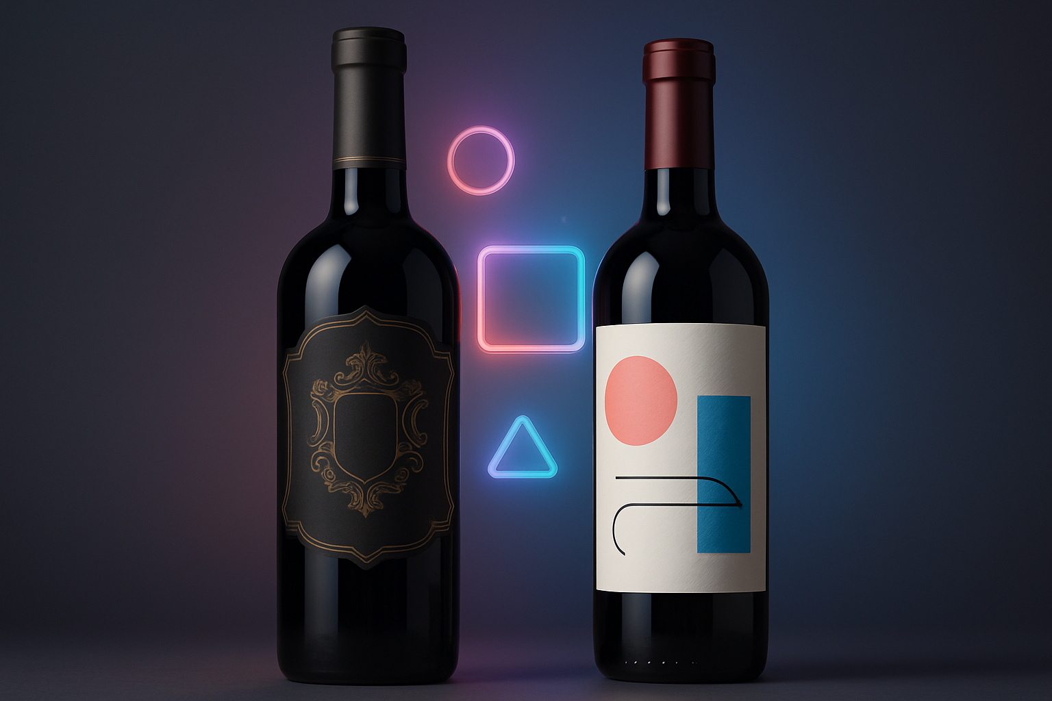
This image has been generated with AI
The impact of minimalist, pop-inspired packaging and typography in reshaping brand perception.
Younger consumers are rewriting the visual rules of the wine industry. In the past years, wine design communicated heritage: family crests, ornate labels, calligraphic fonts, and long legends about vineyard lineage. These cues served well for older generations, but for Millennials and Gen Z they often feel remote, coded, or simply outdated. These younger buyers tend to decide with their eyes first, before reading the back label or tasting the wine. Today’s new drinkers are visual natives. They grew up swiping, curating their own aesthetics online, and translating images into meaning instantly. In this environment, wine bottles are no longer just packaging, they represent the first form of communication between the brand and the consumer. The design speaks before the label is read, expressing identity, quality, and intent in a single glance.
Minimalist packaging has become a new form of credibility. Clean labels, generous white space, sans serif typography, simplified color palettes, all these signal transparency, honesty, and modernity in a world saturated with visual noise. They resonate with younger consumers who value authenticity over excess. “Gen Z looks for minimal packaging… it could be a minimal amount of materials, a small or ‘right’ size pack, or clean graphics.”[1]
Brands that adopt stripped down design convert aesthetic recognition into commercial advantage. For example, a study by Beverage Industry observes that premium beverage brands often lean into sleek, minimalist designs to signal trust and quality.[2] But while minimalism builds trust, pop-inspired design builds emotion. Bold colors, hand-drawn fonts, collage aesthetics and expressive illustrations. Borrowed from streetwear, craft beer and digital culture, make wine more approachable, social media ready and inclusive. These visuals break away from the quiet seriousness of traditional wine branding.
Wine has always been about legacy, but legacy alone no longer sells. Design does. A contemporary label, a refreshed typeface or a bold visual tone can reposition a brand faster than any campaign. For emerging producers and established wineries alike, design is not decoration, it is strategy.